Space as a design tool
Generous spacing gives imagery and key messages room to land rather than compressing everything into a busy restaurant layout.

Hospitality · Fine Dining · Case study
A quieter digital experience for a restaurant where atmosphere matters.
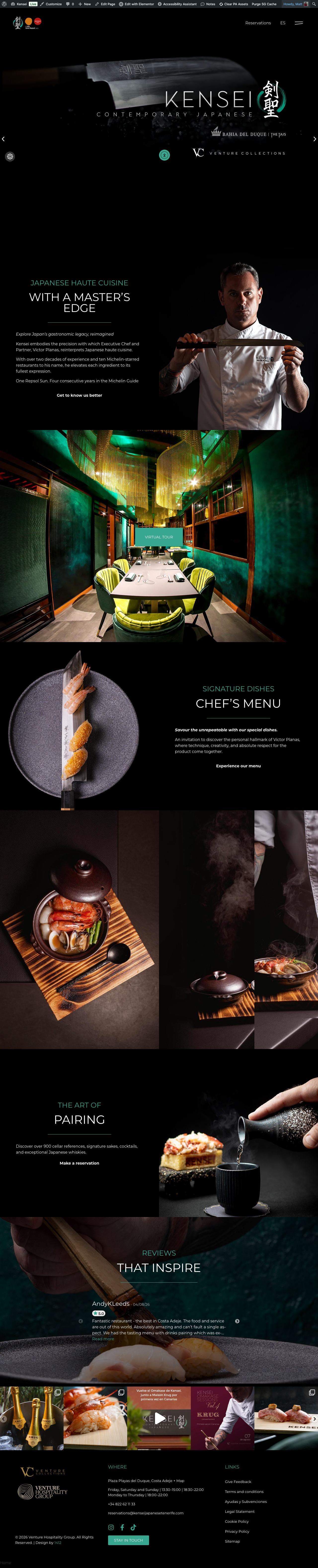
Kensei needed a website that felt refined without becoming decorative for the sake of it. The objective was to let imagery, typography and space create the mood while keeping the restaurant information and customer journey clear.
The brief
A premium Japanese restaurant can easily fall into familiar visual clichés online. The stronger direction for Kensei was to work from the restaurant itself: considered presentation, darker tones, strong photography and a slower visual rhythm.
The site still needed to do practical work — communicate the experience, organise restaurant information and support the path towards a reservation — but without allowing those mechanics to dominate the mood.
Design direction
Where Dedos uses visual volume, Kensei uses control. The interface is intentionally quieter so the photography, spacing and content hierarchy can carry more of the experience.
Generous spacing gives imagery and key messages room to land rather than compressing everything into a busy restaurant layout.
The interface frames the restaurant imagery instead of competing with it through unnecessary graphic decoration.
Typography and contrast guide the eye towards the important information without turning every section into a call to action.

Responsive experience
Large-format imagery and generous desktop spacing only work if the mobile experience is considered independently. The responsive build keeps the same visual tone while tightening hierarchy and spacing for a much smaller viewport.
Desktop layouts are rebalanced rather than simply stacked when the available space changes.
Photography remains prominent without overwhelming headings, navigation or practical restaurant information.
The customer can understand the restaurant and move towards the next action without breaking the visual rhythm.
Typography, spacing and dark framing remain coherent across the full site rather than only the homepage.
Large visual assets are treated as part of the build rather than an excuse for an unnecessarily heavy front end.
The interface is intentionally distinct from the other hospitality projects in the portfolio.
What changed
Kensei demonstrates a different side of the same design approach: start with the business and brand, then choose the visual language that fits it. The result is deliberately removed from the louder restaurant work elsewhere in the portfolio.
The contrast
Kensei uses restraint and atmosphere. Dedos uses volume, colour and immediacy. The visual language changes because the business changes.
View Dedos Tenerife case study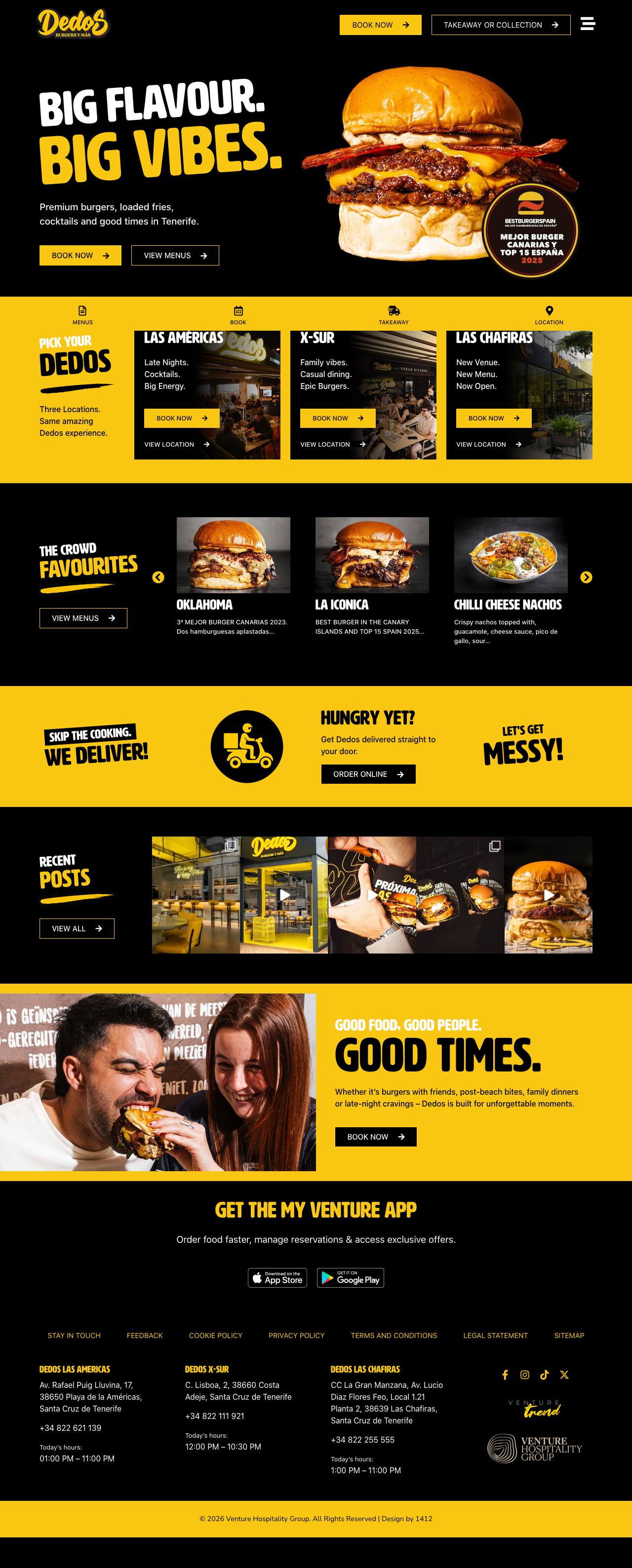
Selected work
The screenshots here are the real live-site designs rather than recreated portfolio artwork. Explore the site itself or head back to the wider 1412 portfolio.
Web Design
Tell us what you are building, replacing or trying to improve. Your enquiry type is already selected below so you do not need to enter it twice.